


Overview
PN Hotels is a hotel booking website that enables users to find the hotel that best suits their itinerary and personal preferences, and book quickly and securely.
My Role
UX/UI Design
Tools
Miro
Figma
Adobe XD
Timeline
Feb 2022
Design Process
Research
User Research
Competitive Interviews
User Testing
Analyse
Affinity Diagram
User Journey Map
User Flow
Information Architecture
Design
Wireframes
Hi-Fi Designs
Prototype
Problem Statement
How might we create a seamless hotel booking process that helps users find the perfect room efficiently and quickly?
01.
Research Phase
We gathered quantitative and qualitative research based on participants' recent experiences.


Which Hotel booking website did you most recently use?
What was your main goal in visiting the website?
"No availability! But for each website, the quicker I could find out they were full, the better. Calendar availability at a glance gave the least frustrating experience on each search, making me more likely to return to try again. Sites that I had to phone, I just dropped from my list!"
Usability Tests
For the usability tests, participants had to carry out two tasks using Booking.com and a similar website, Best Western Hotels. The tests also showed how predictive software at times can lead to more misunderstandings by users not realising what has been entered for them, and how some users didn’t want to compare prices and simply book. Filters were an important part of the selection process for users, and if options weren’t available it created a feeling of frustration.
“I don’t see a filter option for breakfast, so I’m just going to have to look for breakfast… this one I am going to have to go in to each individual hotel and look for breakfast … it’s more effort and time consuming”
02.
Analysis Phase
Identifying common pain-points and potential solutions.
An affinity diagram allowed me to paint a clearer picture of my website structure and help remove any personal design biases, and laying out the MVP.


Thoughts so far
Users had a firm mental model as to the page layout and UI of the website.
Although predictive features can be helpful they can also become Painpoints.
Users want to find and book the best room as soon as possible.
These choices are largely based on images.
I wanted to understand the customers’ goals, and emotions on every step of the booking process. I created a user journey map, which involved charting the steps of booking a hotel room, from goal/motivation to the final checkout. By splitting the journey into steps, I was able to see where the specific pain points of the journey laid.
Thinking about the User Flow
My objective was to create a user flow diagram based on the ‘happy’ customer path for booking a hotel room. It gave me an opportunity to reflect on ways to make the process more succinct and clear, to reach the goal in optimum time.

Design Goals
Efficient
Allows users to get a room based on their needs
Clear
Reduces risk of error
Quick
Gives vital information so user can complete task as soon as possible
03.
Design Phase

Low Fidelity Sketches
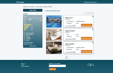
I created low fidelity prototype sketches of the screens. I used thumbnail list layouts, and wanted it to be very image focused by having all images available to maximise and turn into a carousel view. I also wanted key details such as dates and price to remain visible, to avoid any confusion, as well as having the map view optional. On the hotel details page I chose a tabbed format to keep everything neat and succinct. I also chose to have the search bar automatically filled for two people, to save a step for users.
Low Fidelity Wire-frames
I created theses low-fidelity wire-frames, that could be quickly tested and refined. When mocking-these up a couple of changes were made to spacing and layout, so images are a lot more clearer in the list section and the filter box is larger.


User Testing
After completing my prototype, it was ready to be user tested. I wanted to learn how well users interacted with it and ways I could improve it. I ran usability tests with my prototype, and explained to my users that the options were limited. This resulted in a couple of major improvements.
Improvements to the design
After completing my prototype, it was ready to be user tested. I wanted to learn how well users interacted with it and if they encountered any problems. This resulted in a couple of major improvements.


Homepage image
Users found the smaller image above the search bar unappealing.
The image size was increased and the image was desaturated and lightened with an overlay.
Favourite icon
Upon testing users overlooked the favourite icon.
The icon was moved closer to the hotel name.


Booking summary
The initial layout of the booking page didn’t receive positive feedback from users, and upon further investigation the layout conveyed feeling of uncertainty.
Layout was redesigned to include an image of the booked hotel, a progress bar and summary information was placed parallel.


Reflections
If I were to do this project again, I would have included Booking.com in the competitive benchmarking task. My Affinity diagram would have not have been initially grouped by research source and instead I would have focused more on the points when the area are encountered.
My next steps in the project would be to carry out more research usability tests with prototypes which made more of the comparison steps (filter, map, hotel information page) optional, heading to the payment page from the search results page. If the product were released to the general public, I would also run A/B tests, with the automatic two people option in the search bar, to truly see as to whether or not it is helpful or a hindrance. I would also run more tests on whether users use the remove and favourite buttons to free up the list and limit scrolling.