
Overview
Bean There is an app designed for urban areas where people can find out the capacity of local cafés, ensuring they can have a table when meeting with a friend or intending to some work.
My Role
UX/UI Design
Tools
Miro
Figma
Adobe XD
Timeline
Two week Sprint
Design Process
Research
User Interviews
Competitive Research
User Testing
Analyse
User Journey Map
User Flow
Information Architecture
Design
Wireframes
Hi-Fi Designs
Prototype
Problem Statement
Crowded and busy spaces can be stressful for some people, they may prefer a quiet place to meet their friend, or partake in a solo activity like reading or drawing. Other people may be anxious at the thought of not being able to find a seat in a café, and it could be frustrating to turn up to a full café, having to wander around and look for another.
01.
Research Phase
I analysed the layout for Google Maps and the Trip Advisor app in order to establish the mental model of users, paying particular attention to the screen ratios.
In my research I discovered the key information the user would need, and focused on a simplicity throughout the design process.
I also conducted a survey, my results showed that most participants went to meet a friend but some went to conduct work in the café. However I acknowledge that my results may be skewed as I am friends with many PhD students and remote workers.

“It’s really awkward when you go to a place to work, and they have a No Laptops sign.”
“I don’t like turning customers away.”
“Taking my laptop to other places, helps me problem solve from a different perspective.”
“It’s a bit awkward waiting for a seat at a busy café. It’s like you are watching people until they leave.”

“We have no Wifi available for customers. Being near a Uni we don’t want students only buying one drink and spending hours at their laptops. We want this to be a social place.”
Thoughts so far
I acknowledge that by conducting my research in a university town, my results may have been slightly skewed, however students and lecturers could be users of the app. The data implies that the app needs to take into account if laptops are permitted in cafés . The data also supports the hypothesis that people dislike waiting, because of this, in this early stage the app information architecture will be linear. This is because the customer wants the app to carry out the task of finding a seat, and then it won’t likely be used again until the problem re-occurs.
02.
Analysis Phase
Customer Journey
By designing the ‘happy path’, I was able to realise the steps the user would be taking. It made me think about their ‘spring of goodwill’ and how their true goal was to get to the café rather than use the app, which is a facilitator. I thought about how the UX needed to be succinct for this. I devised the ‘traffic light system’ for capacities as a quick way for the user to get the information they need, and inspiration from Trip Advisor to make use of images, to enable a quick decision on their destination.

User Flow Diagram
Mapping the user flow made me aware that, by giving many options of cafés, the user may reject some, and so would need an exit from the Café Information Page. Designing the flow also made me reflect on the feedback screens, and so the Loading and Goodbye pages were added, to give the user the reassurance that the app was working and also had a defined ending point.
.jpg)
03.
Design Phase
Low Fidelity Sketches
I created theses low-fidelity wire-frames, that could be quickly tested and refined. When mocking-these up a couple of changes were made to spacing and layout, so images are a lot more clearer in the list section and the filter box is larger.
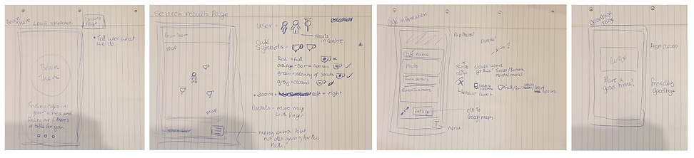
During this processes I thought about how numerous parts of the design had to be feedback indicators to reassure the user that they are moving closer to their goal. This also had to be reflected in the copy, and on the Loading page I felt it was a nice opportunity to add something which summarised the goal of the app for that added reassurance. I later decided on ‘finding you a seat’.
I noted that the map needed to show basic information, but it couldn’t be cluttered. It would only show road names and key landmarks. In my early drafts I had the app name on the bottom of the screen, but removed it in later prototypes, to keep with the theme of simplicity.
During this part of the design phase, I considered the ‘no’ decision on the flow diagram, allowing the user to have an ‘exit’ from the Café Information Page. I used dating apps like Bumble as a mental model, and had visions of the user swiping away the café. In my earlier drafts I questioned whether there needed to be an affordance either through a symbol or copy on the page to show this. I later settled with using touch-sensitive animation, and copy on the bottom of the page.
Low Fidelity Wire-frames


During this processes I thought about how numerous parts of the design had to be feedback indicators to reassure the user that they are moving closer to their goal. This also had to be reflected in the copy, and on the Loading page I felt it was a nice opportunity to add something which summarised the goal of the app for that added reassurance. I later decided on ‘finding you a seat’.
I noted that the map needed to show basic information, but it couldn’t be cluttered. It would only show road names and key landmarks. In my early drafts I had the app name on the bottom of the screen, but removed it in later prototypes, to keep with the theme of simplicity.
During this part of the design phase, I considered the ‘no’ decision on the flow diagram, allowing the user to have an ‘exit’ from the Café Information Page. I used dating apps like Bumble as a mental model, and had visions of the user swiping away the café. In my earlier drafts I questioned whether there needed to be an affordance either through a symbol or copy on the page to show this. I later settled with using touch-sensitive animation, and copy on the bottom of the page.
User Testing
After completing my prototype, it was ready to be user tested. I wanted to learn how well users interacted with it and ways I could improve it. I ran usability tests with my prototype, and explained to my users that the options were limited. This resulted in a couple of major improvements.
Improvements to the design
I wanted to learn how well users interacted with it and if they encountered any problems. This resulted in a couple of major improvements.
Splash Page
Users found the initial design too busy.
Elements were scaled back and simplified in order to create a more succinct design.


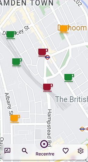
Icon Colours
Feedback from users indicated that the contrast of the icons and their size blended in with the map too much, and might cause issue if they were in a hurry.
The saturation was increased and brightness was decreased, in order to create a deeper contrast from the map, as well as a slight drop shadow was added to give more definition to the icons.


Navigation Bar
This was the biggest change to the app. Whilst testing users pointed out that it was difficult to return to their original place on the map. They were also unsure of why there needed to be a hidden burger menu.
I returned to drafts as to what was originally intended to be hidden in the burger menu. A total of 4 menu items and a recentre button would not take up much real estate. I added a navigation bar at the bottom of the map. By doing this the app takes on a more hub and spoke quality to the IA, but I don’t think this would interfere with the original linear design of the happy path, however further user tests will need to be conducted to confirm this.
Design Components


Final Thoughts
If this were a real project, I would conduct user testing of this version of the app on location. One of the questions I would ask is if the user needed ‘onboarding’ to use the App, or they picked it up more intuitively. As well as whether or not to show closed cafés.
I would also conduct research on what users needed in the sections section, such as creating a mode for those who are colour blind.